Intro
Today, not a lot of text. Just the code and output for selected COVID graphs.
Load
covid <- read_csv("https://covid.ourworldindata.org/data/owid-covid-data.csv")
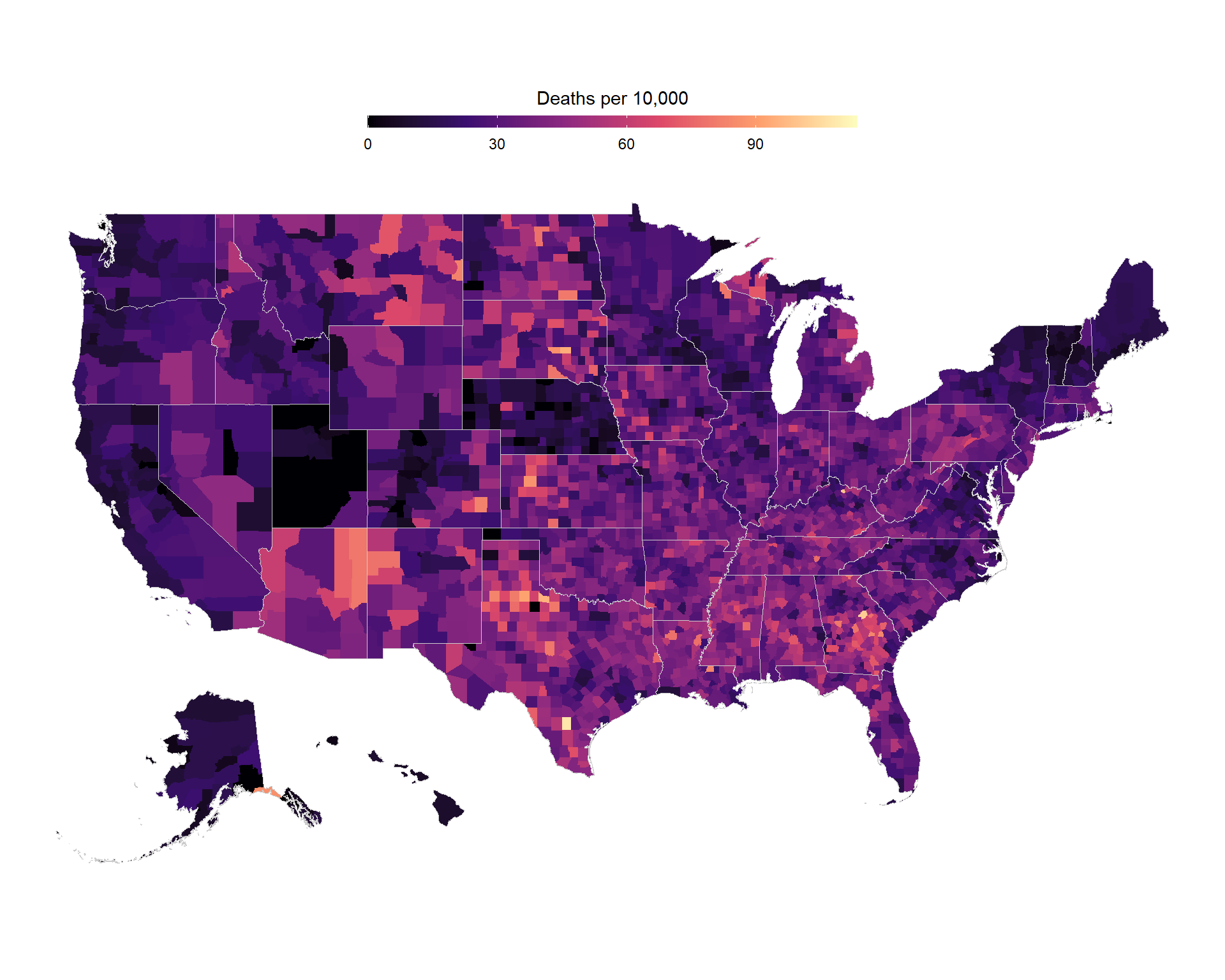
US Counties Map of Death Rates
us_deaths <- read_csv("https://raw.githubusercontent.com/CSSEGISandData/COVID-19/master/csse_covid_19_data/csse_covid_19_time_series/time_series_covid19_deaths_US.csv")

counties %>%
    mutate(county_fips = parse_number(county_fips)) %>%
    left_join(
        us_deaths %>%
            select(FIPS, Population, deaths = last_col()) %>%
            mutate(deaths_10000 = 10000 * deaths / Population),
        by = c("county_fips" = "FIPS")
    ) %>%
    ggplot(aes(long, lat, group = group)) +
    geom_polygon(aes(fill = deaths_10000)) +
    scale_fill_viridis_c(
        option = "magma",
        guide = guide_colorbar(
            barwidth = 20,
            barheight = 0.5,
            title.position = "top",
            title.hjust = 0.5,
            title = "Deaths per 10,000"
        )
    ) +
    geom_polygon(data = states, color = "grey80", fill = NA, size = 0.2) +
    theme_void() +
    theme(legend.position = "top") +
    coord_map() +
    labs(x = "Longitude", y = "Latitude")
Time-series of Cases, Deaths, Vaccinations, and Tests
g1 <- covid %>%
    filter(location %in% c("Israel")) %>%
    select(
        location,
        date,
        new_cases_smoothed_per_million,
        new_deaths_smoothed_per_million,
        new_people_vaccinated_smoothed_per_hundred,
        new_tests_smoothed_per_thousand
    ) %>%
    pivot_longer(-c(location, date)) %>%
    mutate(name = str_to_title(str_replace_all(name, "_", " "))) %>%
    replace_na(list(value = 0)) %>%
    ggplot(aes(date, value, col = name)) +
    geom_line() +
    facet_wrap( ~ name, scales = "free_y", ncol = 1) +
    scale_x_date(date_labels = "%b %Y") +
    labs(x = "Date", y = NULL, title = "Israel, summary") +
    scale_y_continuous(labels = comma_format()) +
    theme(legend.position = "none")

ggplotly(g1)
Vaccination Rates by Continent
set.seed(123)
g2 <- covid %>%
    select(continent, location, population, date, total_vaccinations_per_hundred) %>%
    drop_na(total_vaccinations_per_hundred, continent) %>%
    group_by(location) %>%
    filter(date == max(date)) %>%
    ungroup() %>%
    mutate(continent = fct_reorder(continent, total_vaccinations_per_hundred),
           Vaccinations = total_vaccinations_per_hundred,
           Location = location) %>%
    ggplot(aes(Vaccinations, continent, label = Location)) +
    # geom_boxplot(aes(fill = continent), alpha = 0.3, outlier.alpha = 0, width = 0.5) +
    geom_jitter(aes(fill = continent, size = population), width = 0, height = 0.25, shape = 21, color = "black") +
    scale_fill_brewer(type = "div", palette = 5) +
    scale_color_brewer(type = "div", palette = 5) +
    theme(legend.position = "none") +
    labs(y = NULL, x = "Vaccinations per hundred people") +
    labs(title = "Inequality in Vaccination Rates") +
    scale_size_continuous(range = c(3,8))

ggplotly(g2, tooltip = c("Location", "Vaccinations"))
Vaccinations Scatter-Plot
g3 <- covid %>%
    select(continent, location, date, population,
           people_vaccinated, people_fully_vaccinated) %>%
    na.omit() %>%
    group_by(location) %>%
    filter(date == max(date)) %>%
    ungroup() %>%
    mutate(across(ends_with("vaccinated"), ~100 * .x / population)) %>%
    filter(people_vaccinated <= 100,
           people_fully_vaccinated <= 100,
           people_fully_vaccinated <= people_vaccinated
           ) %>%
    mutate(fully_vaccinated_rate = 100 * people_fully_vaccinated / people_vaccinated) %>%
    rename(
        `% First Vaccination` = people_vaccinated,
        `% Second Vaccination` = people_fully_vaccinated,
        `% Second Vaccination out of First` = fully_vaccinated_rate,
        Location = location
    ) %>%
    ggplot(aes(`% First Vaccination`, `% Second Vaccination out of First`, size = population, fill = continent, label = Location)) +
    geom_hline(yintercept = 100, lty = 2, color = "grey50") +
    geom_point(alpha = 0.7, shape = 21) +
    theme(legend.position = "none") +
    scale_size_continuous(range = c(2,8))

ggplotly(g3,
         tooltip = c("Location", '% First Vaccination', '% Second Vaccination out of First'))
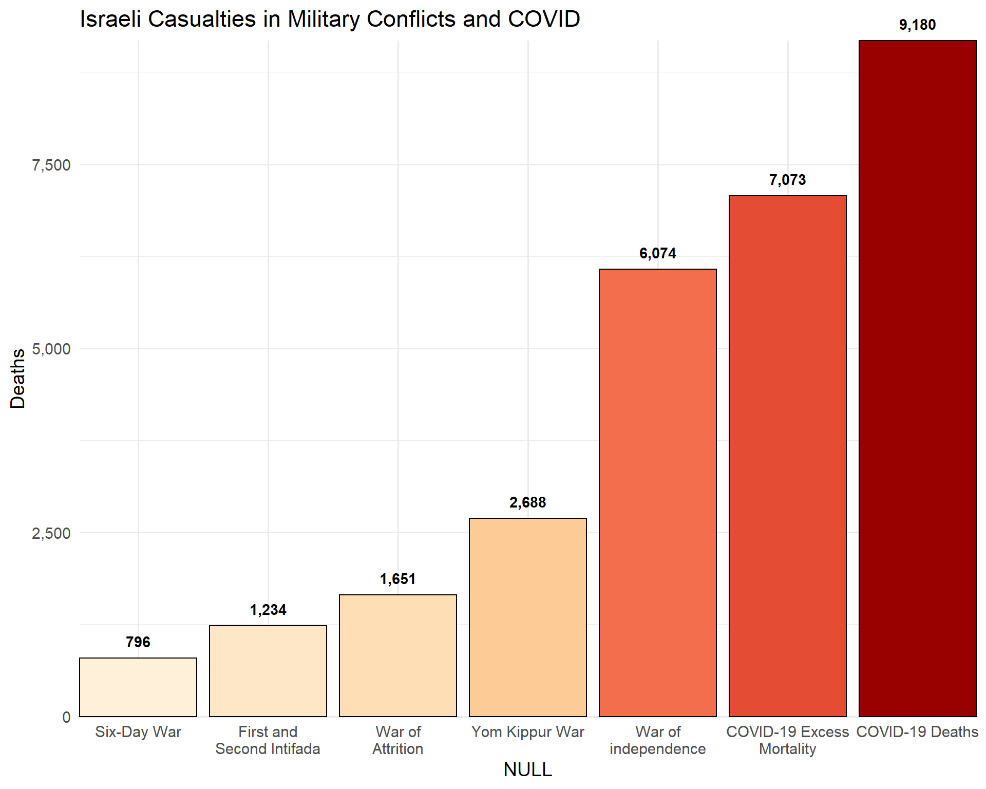
Casualties of military conflicts and of COVID
c19em <- covid %>% filter(location == "Israel") %>%
    summarize(max(excess_mortality_cumulative_absolute, na.rm = T)) %>%
    pull() %>% round()

c19d <- covid %>% filter(location == "Israel") %>%
    summarize(max(total_deaths, na.rm = T)) %>%
    pull() %>% round()

conflicts_il <- tribble(
    ~conflict, ~losses,
    "War of independence", 4074 + 2000,
    "Six-Day War", 776 + 20,
    "War of Attrition", 1424 + 227,
    "First and Second Intifada", 301 + 773 + 60 + 100,
    "Yom Kippur War", 2688,
    "COVID-19 Excess Mortality", c19em,
    "COVID-19 Deaths", c19d
)

conflicts_il %>%
    mutate(conflict = fct_reorder(str_wrap(conflict, 15), losses)) %>%
    ggplot(aes(conflict, losses, fill = losses, label = comma(losses))) +
    geom_col(color = "black") +
    geom_text(vjust = -1, fontface = "bold") +
    scale_fill_distiller(palette = 8, direction = +1) +
    coord_cartesian(expand = F, clip = "off") +
    labs(title = "Israeli Casualties in Military Conflicts and COVID",
         x = "NULL", y = "Deaths") +
    theme(legend.position = "none") +
    scale_y_continuous(labels = comma_format())
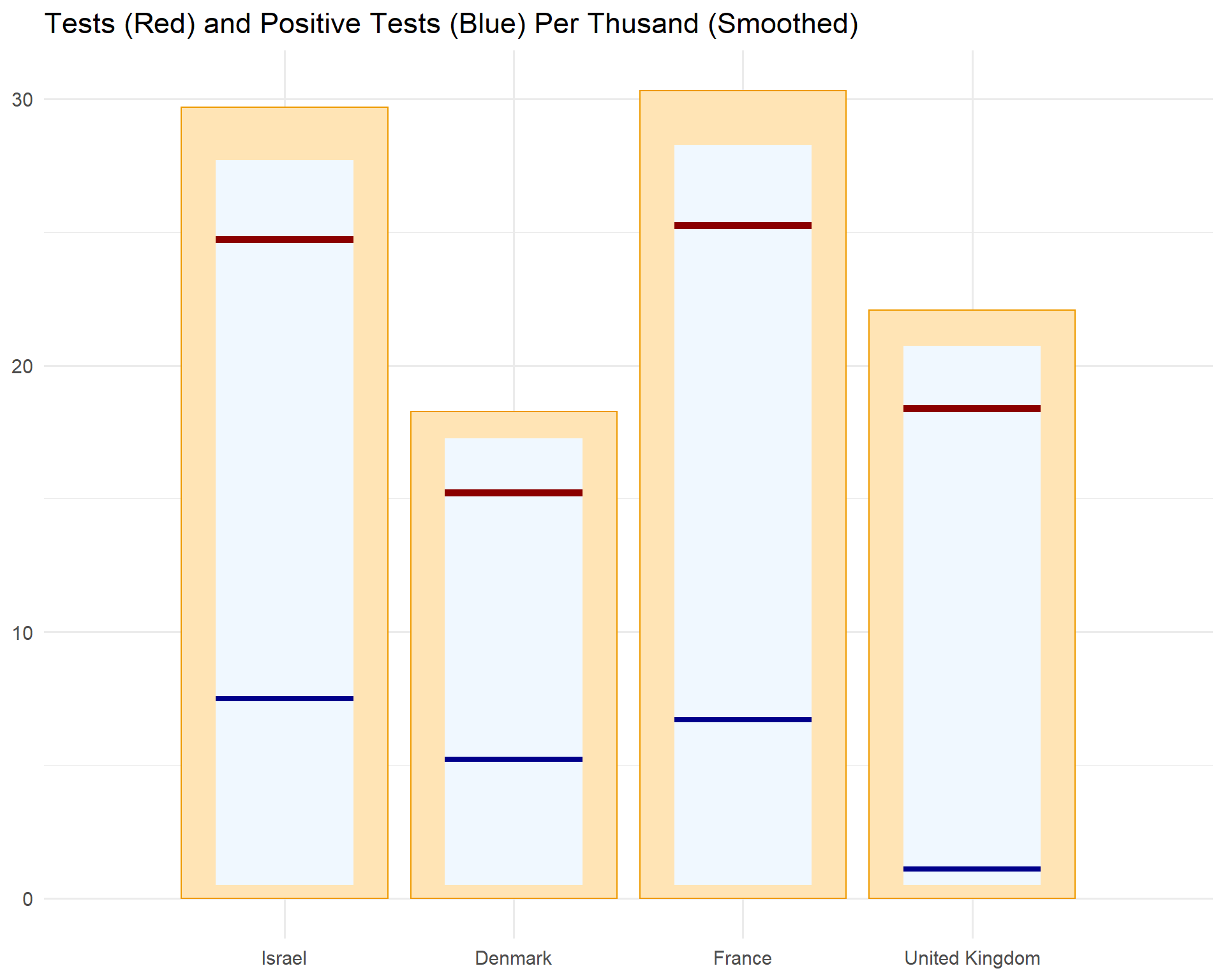
Tests
locs <- c("Israel", "Denmark", "France", "United Kingdom")

covid %>%
    select(location,
           date,
           positive_rate,
           new_tests_smoothed_per_thousand) %>%
    drop_na(positive_rate, new_tests_smoothed_per_thousand) %>%
    filter(location %in% locs) %>%
    mutate(location = factor(location, levels = locs)) %>%
    group_by(location) %>%
    filter(date == max(date, na.rm = T)) %>%
    ungroup() %>%
    mutate(positive_rate_rate = positive_rate * new_tests_smoothed_per_thousand) %>%
    ggplot(aes(x = 1:4, y = new_tests_smoothed_per_thousand)) +
    geom_col(aes(y = 1.2 * new_tests_smoothed_per_thousand),
             fill = "moccasin",
             col = "orange2") +
    geom_tile(
        aes(
            x = 1:4,
            width = 0.6,
            y = new_tests_smoothed_per_thousand*1.1 / 2 + 0.5,
            height = new_tests_smoothed_per_thousand * 1.1
        ), fill = "aliceblue"
    ) +
    geom_segment(
        aes(
            x = 1:4 - 0.3,
            xend = 1:4 + 0.3,
            yend = new_tests_smoothed_per_thousand
        ),
        col = "darkred",
        size = 2
    ) +
    geom_segment(
        aes(
            x = 1:4 - 0.3,
            xend = 1:4 + 0.3,
            y = positive_rate_rate,
            yend = positive_rate_rate
        ),
        col = "darkblue",
        size = 1.5
    ) +
    scale_x_discrete(limits = 1:4, labels = locs) +
    labs(x = NULL, y = NULL,
         title = "Tests (Red) and Positive Tests (Blue) Per Thusand (Smoothed)") +
    scale_y_continuous()