Introduction
In this post, we will recreate a graphic from The New York Times published on Feb 21, 2021. In it, there is a depiction of almost 500K COVID-19 deaths in the USA alone. To be honest, when presenting a time-series it is not often a good idea to show it using this kind of visualization where dot density is conveying the information. But, in this case and context, it is part of what makes this visualization so appealing (and appalling).
During the last year, I worked for six months in a COVID-19 ward in my hospital. We have witnessed deaths day in and day out. I also read the mortality statistics obsessively throughout the year. However, this visualization mixed the pain for each individual together with the volume of total deaths in a way that moved me and made me re-think and re-feel. Kudos to the originators.
Throughout this example, we will discuss the principles and try to recreate it with some minor differences. More customization, highlighting, and fine-tuning is possible. However, we’ll focus on just some of the main properties of this visualization to keep it simple.
Load packages
First, let’s load all relevant packages.
tidyverse loads many packages used for the bread and butter of data science. For data wrangling, there are other frameworks such as data.table that can also be used.
glue is a great package for concatenating (or pasting) strings together.
vroom is a package that speeds-up reading CSV files.
scales is used to change numbers to a comma format.
knitr::kable is used to print the data frame.
Load data
COVID-19 data can be found in many places. Here, we load the data from Our World in Data mostly because it is likely to stay online also years from now.
covid <- vroom("https://covid.ourworldindata.org/data/owid-covid-data.csv")
Quick look
| iso_code | location | date | new_deaths | total_deaths |
|---|---|---|---|---|
| AFG | Afghanistan | 2020-02-24 | NA | NA |
| AFG | Afghanistan | 2020-02-25 | NA | NA |
| AFG | Afghanistan | 2020-02-26 | NA | NA |
| AFG | Afghanistan | 2020-02-27 | NA | NA |
| AFG | Afghanistan | 2020-02-28 | NA | NA |
| AFG | Afghanistan | 2020-02-29 | NA | NA |
Creating our main dataset
We can see that in this dataset each row represents a day in a country. For now, we only need data for USA, and only need the date, number of new deaths, and cumulative number of deaths. The plot starts at the date of the first death. Our Y-axis is going to be days till the last date we choose. For the plot, we need to uncount the deaths so each row is an individual who died.
Downsampling to accelerate drafts
In the final plot, we will use all data points. But, as there are over 500K points, and plotting is slow, it quickens the process if we downsample through drafts until we our satisfied with the result. We use identity() here so we could later comment out the downsampling without errors.
covid_us_downsampled <- covid_us %>%
    sample_n(1e4) %>%
    arrange(date) %>%
    identity()
Creating our annotation dataset
In the original graphic, every milestone of 50K deaths is annotated. To replicate it here we signal every crossing of 50K deaths, and then create the text for annotation–the date and total number of deaths.
break_points <- covid_us_downsampled %>%
    mutate(deaths_50k = total_deaths %/% 5e4) %>%
    group_by(deaths_50k) %>%
    slice(1) %>%
    ungroup() %>%
    mutate(pos = 0, xmin = 0, xmax = 1,
           date_text = format.Date(date, "%b %d"),
           date_text2 = glue("{date_text}\n{comma(total_deaths)}")
           )
Re-creating the graphic
Every death is randomly spread across the X-axis. The value on the Y-axis relates to the date. The slight jitter on the Y-axis is to prevent stripes. In this case, annotations are just geoms created with a different dataset. Using some transperancy allows to visualize overlapping dots.
plot_draft <- covid_us_downsampled %>%
    mutate(pos = runif(n())) %>%
    ggplot(aes(pos, days_to_last)) +
    geom_jitter(size = 0.2, alpha = 0.2, width = 0, height = 0.5) +
    geom_linerange(data = break_points, aes(xmin = xmin, xmax = xmax, y = days_to_last), col = "red") +
    scale_y_continuous(breaks = break_points$days_to_last, labels = break_points$date_text2)

plot_draft
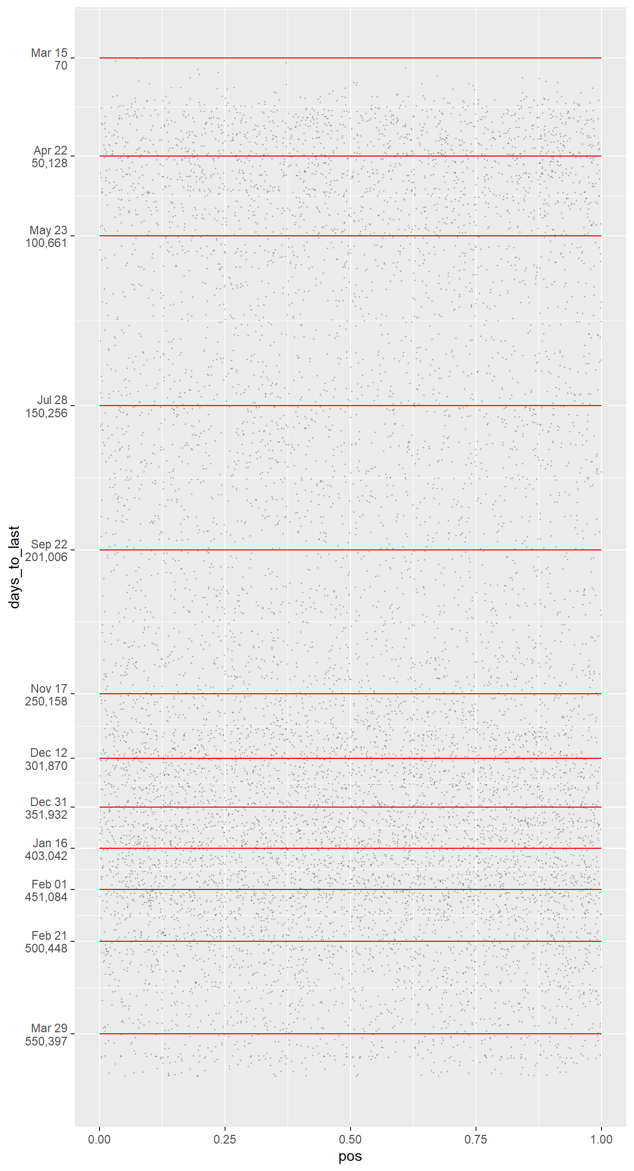
The plot looks fine to begin with, but the axis titles are unneeded, the background is low-contrast, the gridlines are distracting, and the annotations are de-emphasized.
plot_downsampled <- plot_draft +
  theme_classic() +
    theme(
        axis.line = element_blank(),
        axis.title = element_blank(),
        axis.text.x = element_blank(),
        axis.ticks = element_blank(),
        axis.text.y = element_text(color = "red", hjust = 0, face = "bold")
    )

plot_downsampled
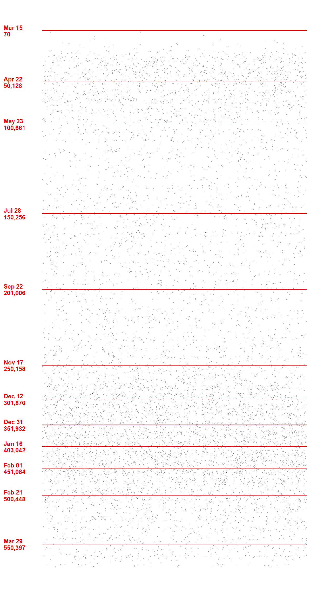
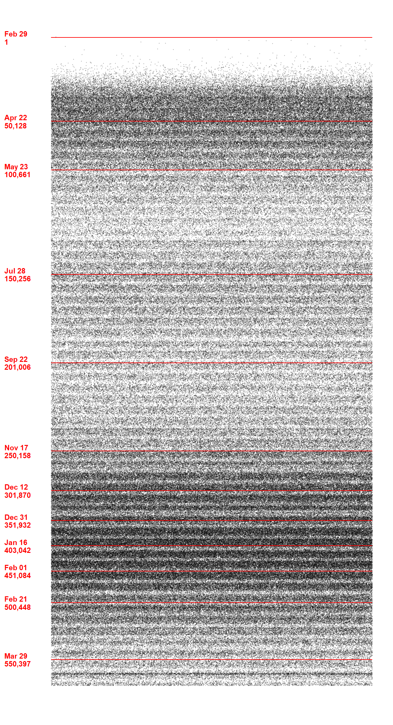
This one looks better. It may look a bit anemic but we should remember we only plotted 1K dots and not the whole > 500K. Now that we are happy with the plot, let us plot all of them.
covid_us_downsampled <- covid_us %>%
    # sample_n(1e4) %>%
    # arrange(date) %>%
    identity()
break_points <- covid_us_downsampled %>%
    mutate(deaths_50k = total_deaths %/% 5e4) %>%
    group_by(deaths_50k) %>%
    slice(1) %>%
    ungroup() %>%
    mutate(pos = 0, xmin = 0, xmax = 1,
           date_text = format.Date(date, "%b %d"),
           date_text2 = glue("{date_text}\n{comma(total_deaths)}")
           )
plot_final <- covid_us_downsampled %>%
    mutate(pos = runif(n())) %>%
    ggplot(aes(pos, days_to_last)) +
    geom_jitter(size = 0.2, alpha = 0.2, width = 0, height = 0.5) +
    geom_linerange(data = break_points, aes(xmin = xmin, xmax = xmax, y = days_to_last), col = "red") +
    scale_y_continuous(breaks = break_points$days_to_last, labels = break_points$date_text2) +
  theme_classic() +
    theme(
        axis.line = element_blank(),
        axis.title = element_blank(),
        axis.text.x = element_blank(),
        axis.ticks = element_blank(),
        axis.text.y = element_text(color = "red", hjust = 0, face = "bold")
    )

plot_final
Key learning points for me
- One strong simple message can be much more moving than many informative-heavy graphs.
uncount()to imitate individual observations from summaries.
- Downsampling to accelerate the workflow until the finishing line.
identity()to allow commenting out in pipes.